
ARES Urbanexus Update #178

The American Real Estate Society (ARES) distributes a periodic compilation of real estate-related news and information curated by H. Pike Oliver. Press the “bar” above to access the free update.


The American Real Estate Society (ARES) distributes a periodic compilation of real estate-related news and information curated by H. Pike Oliver. Press the “bar” above to access the free update.
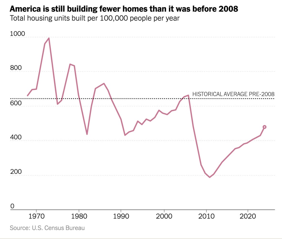
That housing chart really shows the scale of the shortage. We're not even close to pre-2008 levels per capita, which explains a lot about why affordability keeps getting worse. Would be interesting to see regional breakdowns though, since some metros are building more than others.